Saturday, 30 October 2010

Constantly ill apparently

For the past couple of months I've been constantly getting ill. Any time I recover, something else hits me. It sucks and it's making me lazy.
But at least I did this.
I think this is the outfit I'll be sticking with. The fur shawl will probably have animal bits stuck to the end of it, as was the fashion apparently, but I didn't draw it in. 
I'll probably change the earrings to inverted triangles instead of ovals. That way they'll match the necklace and will also have a more Deco-y style.
For some reason it took me forever to draw this. I think I work much too slowly. If I do one character concept a week, I won't have time to finish them, let alone do any finished pictures.
Scary stuff.

Also passports. What stress. I've spent a lot of this week trying to get it sorted. The site says it'll come within six weeks of applying, and it better had. If it comes a day later, that's it. No holiday.

Wednesday, 27 October 2010

Flapper Outfits

Further work on 1920s Assassin.

I like the hair of the first, the colours and the shawl of the second (though it looks terrible there), the shoe style of the third and the hat, necklace and dress of the fourth.

The shawl's meant to be fur, and I think I'm probably keeping it. It's definitely the sort of thing she would wear. I much prefer the long cigarette holder too.

Opinions?
Preferences?
Spam?

Monday, 25 October 2010

First Hons pinup!

I did all my characters, scanned them in (Which induced much raging) and printed them off. Even with four pages on each sheet of paper, I had so many for pinning. As I heard someone aptly call it, there is a 'pin famine' in the class. There aren't enough. Warner was nice enough to lend me some, and I had to be stuper-stingy (Pinning 4 things with one pin often). I still feel like I used too many, but I do need them. I have 10 pages of work, which is more sheets than many people.
Not my fault, right?
...Right?

Anyway, with the pin famine, I didn't put up moodbaords. That'd be an extra 6 pages, and that would be outrageous. I have a ton of pictures though, so I'll pop them on the blog at some point just to show the sort of research I'm using.

Saturday, 23 October 2010

The Flat for reals this time

Apparently, the problem with the Maya file was just that I'm using an older version than the one at uni. Luckily Jack has the new one, so I've salvaged some screenshots with his computer:

Green things are 'portals' (Can travel into dreams through them, maybe?), red things can't be used and the purple thing has an unlockable use (alternate outfits).


I might put some of these in Photoshop and draw over them to give the intended feel and a little detail I want to include.

Thursday, 21 October 2010

The FlatOHWAIT

Well, I found out someone else in my class is doing a game about dreams. Eek. 
Her idea sounds pretty cool: it's about demons that have possessed some children, and a group has come to hijack their dreams and flush the demons out. Hopefully the dream thing won't overlap too much and we'll both have distinct ideas.

After trying and failing to get a good isometric picture of Don's flat, Jack suggested I try making a 3d blockmap. So I did.

...

But Maya, being as brilliant as it usually is, has corrupted the version I had on a memory stick so no screenshots for you today.
Sorry.

Tuesday, 19 October 2010

Western Civ's Colour Practice

Rhoda said I should try to draw one of the characters like the way I did that girl. I chose the Western Fantasy Civilian because she's an interesting shape so it would be a good challenge; and a challenge it was! I don't like it as much as the girl picture, but I'm glad I had a go.

I decided her species is a 'Quilish' race. Just so you know what's intentional and what's not, I'll briefly run over the anatomy.
A Quilish being has a ridge that goes down the centre of their face from the back of their scalp to the tip of their nose. They have horns that are smaller and straighter on females, while the males have longer, more twisty ones (I forgot to draw them in, dur). Their lower jaw is very small, giving females a more heart-shaped face. Males on the other hand, though their jaws are also small, have a wider chin, giving a less "pointy" appearance. The fairly flat (except for the ridge) shape of the nose, with the wide bridge, give a Quilish person an epicanthic fold. Their eyes are very large and the tip of their nose and their mouth are small.
Their ears are fairly big and elongated. They turn down at the end on both genders, but on males they curve back up in a soft flick at the tip.
Quilins have hair that can be remarkably naturally straight (Like the Civ), but can be of any style. Head hair doesn't grow on the ridge, but they are covered in a thin, fine fur which may have splotches of other colour.
Quilish colours can be varied but are often earthy.

And now, the picture. The first is the Civ with no ambient light and the second has a pink light, like sunset. Sorry if the colours are out; I think my monitor isn't showing them normally.


Monday, 18 October 2010

Colour Practice 2

When I said that the blue lighting comes out looking smeary and weird, this is what I meant. They're very rough splotches of colour so it looks even worse, but even if I'd done it neatly it'd probably still look terrible. The one on the left is set to Hard Light and the one on the right is Linear Light.


Surprisingly I couldn't really find any tutorials about lighting. I'm going to skim through one of the links that Bev sent to see if the answer is there.

In other news, I've nearly finished all the basic concepts for characters! Only three more to go. If I get hit by a bus or something in the next few days, at least I can hand in a little bit for every character. Better than nothing!

I'm going to do a colour test thing like that girl picture with one of my characters. I think Western Fantasy Civilian has an interesting face shape so I'd like to give that a go.

Friday, 15 October 2010

Detailed Colour Practice

Bev sent us some links to things that could be helpful, one of them being a list of tutorials. I read one (Yeah, I actually wasn't stupid and stubborn for a change) about making skin look good. It said that spackled brushes are good.
I thought I'd give this brush a try and started drawing a picture, cycnically spackling it a little, and.

Well, I quite liked how it looked.
Instead of giving up and scrapping the picture as often happens when trying new styles, I kept going with it. I didn't even use lines in the end. All in all, I was quite happy with how it turned out. It's no masterpiece, but it looks a little more passable than most of my other stuff.


I had a go at doing some lighting but it didn't work out. Any time I tried an interesting colour (Mostly blue) it looked smeary and weird. Maybe I'll get it some other day, but for now this is good enough.

Proposal, etc.

I pinned my work up for the GDD nice and early so I got a good spot, derp. Sneaky tactics. I really wanted the DoweyWall (The one near the office) because it's easy to reach and there's plenty of room. I got it, so hooray!

A lot of people only did moodboards for some reason. I guess there was some confusion and people didn't read the email.

Anyway, here's Don and Blackbuck. Aside from future tweaking, this is basically how I want them to come across.

Monday, 11 October 2010

Optimism!

I'm glad I started this blog because I've been getting some great feedback from people.

The tutors are all very helpful (Obviously). I sometimes feel like I'm pestering them way too much because I'm always shoving sketchbooks in faces and mithering them for advice. I guess it's better than just assuming what to do and getting on with it alone...
... Right?
Katy and Jonny have both given me some useful tips for my problems with Eastern Fantasy. They've made me feel like I get it better, and which sort of themes I should be looking towards for inspiration.
I always get Jack to check over my scribbles to see if I'm heading in the right direction.
Rich sent me this link that is exactly the way I feel about my sexy-female-characters rant. He's phrased it way better than I did.
It's worth watching!

Back to work with GDD proposal. So far I've done a mood board, but I'm not entirely sure what the writing/picture ratio should be. Is it meant to be quite descriptive or more concept-artsy? Should it be flashy with nice backgrounds and things, or does that come later?
I think I'm doing too much Honours compared with GDD and Futures. I find it hard not to get caught up in it, what with it being bigger than any other project like it that I've done. I did a couple more characters today but I can't be bothered to upload these yet; the batteries I have are so bad that I can only take a few pictures with the camera before it eats them.

Sunday, 10 October 2010

It's why I'm not doing environments

Well, Jack kept asking me to tart up a doodle of his crush, the Western Fantasy Civilian, so that's what I did today.
He named her and everything.


This isn't a final design. It's just a fancy concept sketch.
I'm sure you can tell from this picture that I hate doing backgrounds and still haven't got the hang of them.
Some day I'll learn.
But not today.


Biggest Possible Art Dump

This is going to be huge because the next upload is over half of the character concepts. It's going to take ages, but it's the only one that can be this big.
So, here are the next 20 characters!

Good Punk Civilian

 Good Punk Assassin

 Good Punk Tank

Good Western Fantasy Civilian

Good 1920s Civilian

Neutral 1920s Soldier

Good 1920s Support

Evil 1920s Tank

Evil Eastern Fantasy Assassin

Neutral Eastern Fantasy Civilian

Evil Eastern Fantasy Range

Good Eastern Fantasy Soldier

Good Eastern Fantasy Support

Evil Horror Assassin

Good Horror Civilian

Neutral Horror Range

Evil Horror Tank

Good Modern War Civilian

Evil Modern War Tank

Good Western Fantasy Support

So, that's a lot of characters to digest. I think I'm happy with how most of them are developing, but others (such as the Eastern Fantasy Civilian) are probably going to get a big makeover.
I'm doing my best to ensure I get at least one of each possible combination - such as good tanks, female 1920s, neutral males, etc - to show variety in the characters. I don't want to wind up with 6 evil assassins or an all-female team. It gets a bit difficult towards the end of a category because it sometimes ends up looking a bit biased towards one of them, so I have to really concentrate on balance.

Saturday, 9 October 2010

2 Character problems.

One problem is directly in regards to Honours, the other is about designing characters in industry.

Firstly, it's Eastern Fantasy again. I'm having doubts about even doing this. A while ago, I had problems distinguishing between East and West fantasy. I've been clawing my way through it slowly, and today I decided to look into what exactly inspired Final Fantasy - one of the most Eastern fantasy titles out there - to see if I could find anything I may have overlooked that is a big part of the genre.
What do I find?
It was inspired by
three
Western
fantasy
games.

NGGHGHGNNNNGGHG

Any time I feel like I'm getting somewhere with distinguishing the two, something gets thrown in my way that glues them together again.


The next problem is just characters in general. This course challenges us to be creative and really make something intelligently enjoyable rather than just a flashy cheap thrill.
For example, if I were to do a character for this project that was just a hot girl in a tiny bikini, I don't think it would get me a good grade.
For the most part, this is fantastic. I love good characters and I struggle to enjoy a game without them.
However.
When we look at the big titles out there, what kind of characters do we see?
Compare and contrast
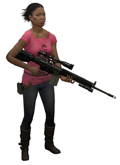
 Rochelle, who a lot - a LOT - of gamers hate. Some say it's because she's boring, annoying, loud, goofy, sombre or "not black enough", but some have the slightest shred of decency to at least admit they don't like her because she isn't "hot" enough.
The horrible thing is, it's not just the fault of immature, sleazy designers. Why? Because the people lapping this tragic garbage up - and requesting more - are the ones buying the games.
This is what people want.
And what do I do about that?! Surely the best plan is, course be damned, to be part of a company that does nothing but these sorts of characters. I wouldn't enjoy it, but I guess it beats being unemployed. They even probably make a lot of money.

It gets me down sometimes because it makes me debate what a good character really is. I generally think it's someone who is believable, riles an appropriate emotion (such as really rooting for them, or loving to hate them) and is a joy to watch. But if what people want is someone pretty, thin and barely dressed, who am I to judge? If anyone is going to be right, it's the majority - and they are the majority, not me.

Good female characters can be such a rarity, so I am really trying to design mine to have more than one dimension. Sometimes they aren't pretty. Sometimes they aren't thin. But at the very least, they will have personalities, purpose, and above all, substance.

EDIT: I also wanted to say that male characters get this sort of treatment too in the form of being huge hulking muscle-men, but if I wrote about them too this post would be even more unbearably long.

Thursday, 7 October 2010

Not much news,

But I felt like I should write something because it's been quite a while.

I spoke with Rhoda about the GDD today and I definitely get to do ViDys (hooray!) so there will be more from that, and not so much anything on the other two. I do like some ideas from them though, especially the glitch one. I'm thinking of adding a mechanic that's inspired from both a dream and a common glitch. In some levels, Don might be able to jump through particular corners or walls to progress. I think it'd be fun watching him inexplicably squeeze through an impossible space.
Though that may be too hard to do visually.

For example, here's a video from Donkey Kong 64 of corner-jumping:


I'm getting on a little better with my Futures, though I'm really finding the non-verbal part hard. I'm not finding that much on it other than a lot of people saying that humans use it a lot. IP is especially hard.
I think one problem is that all three topics are similar and there's a lot of stuff that crosses over. I'm not really sure what to put where. After all, representing colour with emotion and using symbols are both forms of nonverbal communication.I think I should focus more on the body language side than simply the umbrella term of "non-verbal communication".

Tuesday, 5 October 2010

Back On Track

I didn't have such a great start to this week. I'd sort of burnt myself out a little and my work was fairly lacking. I'd been working a lot of the time most days, thinking it was the only way to make progress, and obviously it didn't work out so great. I think Futures suffered the most, because what should have been an easy, fun, smoothly flowing project seemed to be a confusing, rigid, bumbling mess. I just couldn't properly get into it.
Thankfully, Bev helped me approach it the way I should have, and now that I'm trying again it seems to be flowing much better.

I mainly wanted to write this post to show some art I found that really captures the point I wanted to make about colours and emotions. Some art seems to be a bit cryptic, like it doesn't really speak to me in the way I think the artist intended, but looking at this just seems like it would be evocative to anyone. It's very stunning and seems to have an almost nostalgic beauty about it, like the way one might perceive a memory.

Here is some of Leonid Afremov's work.